
Paper, Cut: The Bleeding Edge of Government Forms
Designers can create simple, beautiful, easy-to-use government forms with ease. So why can’t government? The answer may be a matter of perspective.
By Andrew Maier
In May of this year, Molly McLeod, a Code for America Fellow, took receipt of a vote-by-mail ballot issued to her by the city of Oakland, California. She dutifully opened it, read its accompanying instructions and recorded her vote but, by her own account, nearly missed the fact that her ballot required a postmark by May 29th in order to be counted at all.
Frustrated by her experience, Molly decided to redesign her ballot’s instructions. Over the course of twenty minutes, she masterfully rearranged its elements so that they better aligned with her understanding: The most important information (i.e. how to ensure that the ballot was counted at all) came first and the minutiae of voting came second. When she was finished, Molly shared a before and after photo on social media.
It is important to note that Molly’s redesign was unsolicited; the city of Oakland neither asked nor encouraged Molly to expend her energies in this way. And that is exactly why her work serves as such a great example of civic hacking in action. If a hack1 is any amateur innovation on an existing system, then civic hacking is simply a hack on government to improve the citizen experience. Molly sought to improve the experience of voters in Oakland by showcasing the power of design to communicate effectively.
Many acts of civic hacking begin in this way: with what the Japanese call Shosin, or “beginner’s mind.” Rather than perceiving government as it has come to be, civic hackers imagine government as it might become2, unencumbered by the constraints that come from full knowledge of context. When Molly redesigned her ballot’s instructions, she did so in willful ignorance of the fact that ballot design is often subject to pretty stringent regulation.
Molly’s work is compelling, to say the least. So why are the benefits of civic hacking not more widely seen across government forms? How does Oakland arrive at the instructions it provides to voters, anyway? How much time do they spend designing their ballots? And, more generally, how should government approach this kind of problem?

These questions are difficult to answer, but it is at least clear based on the instructions that Molly received that the city approached this particular design problem quite differently that she had done. For starters, the designers working within government were indeed beholden to regulation. More importantly, they probably did not have as much of a chance to experiment with their design. And, finally, why should they redesign their forms when the ones they have used to date have worked well enough?
While government actors can, and often will, rationalize their efforts to enforce the status quo, civic hackers have the potential, through their independent actions to imbue “the status quo” with new meaning3. In this article I hope to more clearly qualify the ways in which civic hackers might do that viz. a viz government forms and, in so doing, provide a map for future design endeavors centered around government forms.
A formal function
Before we dive in, let’s establish some definitions to help frame our discussion. In the infamous “vending machine” metaphor for government, forms serve as the primary means by which government collects citizen data in exchange for goods or services.
To ensure that government-provisioned goods and services align with public interest, government bears the responsibility of creating and maintaining information ecosystems. Information ecosystems describe an interrelated set of protocols, processes, platforms, policies, and principles designed to ensure that government-provisioned goods or services act in the public interest.
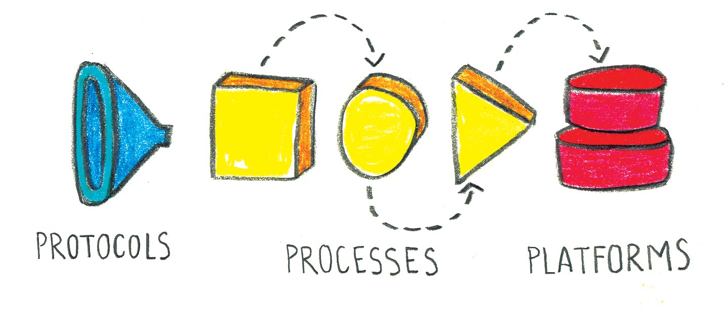
In this article we will limit our analysis to three of these elements: protocols, processes, and platforms.
-
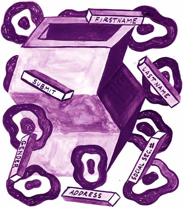
Protocols are the interfaces by which government and citizens exchange information, goods, and services. This article will largely concern itself with the (paper) forms that citizens fill out to give governments information about themselves. Forms effectively facilitate a one-directional conversation from citizens to governments.
-
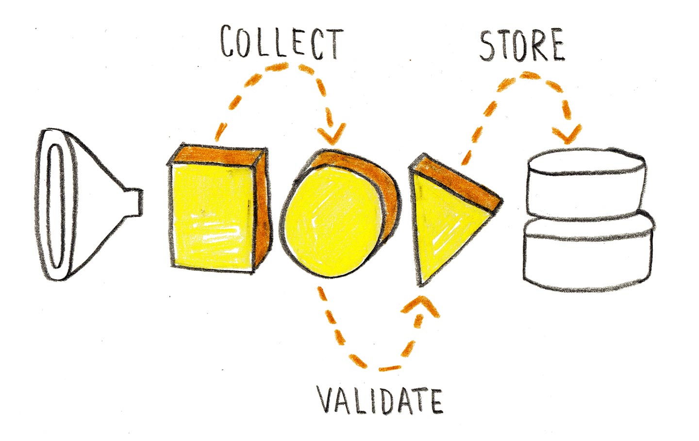
Processes are any of a number of steps taken to either (1) aid in the function of a protocol or (2) transform data as it moves through an ecosystem. In practical terms: paper forms must be distributed, collected, validated, and stored. Government-sponsored goods and/or services must be distributed fairly and measured against success metrics.
-
Platforms serve as the technological basis for the accrual and dissemination of data4. Platforms are difficult to architect because they are often a product of an information ecosystem’s protocols and processes—and vice versa. If a government employs paper forms to collect data, for example, they will likely distribute, process, and store those forms in a purely analog way. This limits government’s ability to retrieve and/or share data upon request.
Like all models, this conception of information ecosystems simplifies the reality it describes. Nevertheless, its utility lies in the perspectives it engenders. Many government agencies, for example, have struggled as they’ve worked to transition from paper-rich to digital-rich information ecosystems5. Thinking about this transition in terms of protocols, processes, and platforms effectively breaks it down into more manageable design problems. Additionally, this conception allows designers to draw upon the research and innovation already conducted in these discrete areas of study. Finally, the act of modelling information ecosystems encourages designers to consider the relationships between the various elements comprising the system. This, in turn, helps designers eschew form-centered approaches in favor of more people-centered ones.
Now that we’re speaking the same language, let's continue our analysis of “form design” by more closely considering how user-centered designers and civic hackers might work to change the individual elements constituting information ecosystems: protocols, processes, and platforms.
Protocols as interface to government
The ubiquity of protocols cannot be overstated. Whether we are signing up for food stamps, paying our taxes, or casting a ballot, every citizen is likely to, at one point or another, use a protocol—a form—as an interface to government. This ubiquity makes forms a highly desirable jumping off point for designers wishing to improve the citizen experience. (“By making the form better, we could potentially make the entire interaction better, right?”)
Not so fast. The user-experience design community has frequently noted the fallacies of approaching user-centered design by way of interfaces. Specifically, they warn that the user interface of software is just one of many levels of abstraction at which designers can solve problems for users; that it's often the case that the elements detracting from a user’s experience originate at “higher” levels within an organization, such as in its application architecture, its strategy, or its design principles. The history of design failures implies that designers hoping to improve the citizen experience by way of government forms will need to not only wield expertise in the principles undergirding form design itself, they will also need to understand and work to change the context in which forms are situated.
Designer Drew Davies shares a story that works to corroborate this sentiment. In 2011, the Federal Voting Assistance Program (FVAP) commissioned Davies and Dana Chisnell, a usability professional and Co-Director of the Center for Civic Design, to improve the design of the Federal Post Card Application and the Federal Write-in Absentee Ballot. Davies remarks: “It’s safe to say the[se] forms had not been critically reviewed in a long time (perhaps ever), and were some of the worst examples of confusing, difficult-to-use government forms.”
To improve the forms, Davies and Chisnell proceeded in the typical user-centered design way, conducting 28 usability tests throughout the year. Whenever the team noticed particular elements that confused voters, they created a new version of the form that ameliorated the cause for confusion (as McLeod did with her ballot’s instructions). They quickly learned by iterating, testing, and evaluating the designs of both forms in question.
And rather than simply figuring out which design tested well, Davies and Chisnell went one step further, seeking “to learn where voters had questions and made mistakes, and why.” This was a subtle goal with profound implications: By seeking to understand voters rather than forms, Davies and Chisnell came to understand those voter’s perceptions and rationalizations. This helped the team do more than critically assess the forms they were given, as the FVAP requested; it also gave them insight into how the instructions, the forms, and the FVAP website worked in tandem to affect the voter experience.
At the end of their research endeavor, Davies and Chisnell provided the FVAP with a report6 that included redesigned versions of the requested forms as well as recommendations for the instructions and the website that accompanied them. And that’s when the disconnect happened: While many of their visual design changes were adopted, their recommendations for simplifying the forms’ instructions were not. Why would the FVAP ignore recommendations that were based on user research?
Before we address that question it’s worth noting that this situation was possible in the first place, a fact directly related to the difference between agency and authority with regards to the design process. While Davies and Chisnell were given the agency to explore the design space, they were not given the authority to put their design into practice. That power rested with the FVAP. Davies’ story highlights a design truism: the difference between a designer’s agency and his authority helps determine the degree to which he can effect change.
Understanding the difference between agency and authority makes it easy to describe the ignorance willed on the FVAP’s behalf: Davies and Chisnell’s recommendations were likely ignored due to a mismatch in the design agency and design authority on the part of the person who initially commissioned the project. Davies even insinuates as much in his post: “a decision was made to ignore this recommendation.” Thankfully, two years later, the FVAP is under new leadership and is reconsidering the pair’s original recommendations.
Despite having acknowledged the problematic nature of approaching form design via forms themselves, let’s continue down this path. We will begin by addressing some of the inherent differences in presenting forms in print and online before reviewing some of the ways in which contemporary form design is currently shaped by the work of independent designers, developers and governments alike.

At its core, design is a rendering of intent, a plan for change.
In theory
At its core, design is a rendering of intent, a plan for change. In order to effect a change in perspective, designers rely on a fundamental knowledge of perceived affordances.
An “affordance” is a term originating from the field of psychology7 used to refer to the possible relationships between an actor and his or her environment. An actor might sit in a chair, for example, but he also might stand on it or pick it up. Since its inception, the concept of affordances has been adapted and expanded by the design community to that of “perceived affordances8.” Perceived affordances are the uses to which an individual (the “user”) is likely to place an object given their perception of that object, specifically that object’s user interface.
Forms adopt different perceived affordances depending upon whether or not a designer chooses to render that form across analog or digital media. Paper forms, for example, are easily “sized up” based on their page count. Web-based forms, on the other hand, do not inherently offer this affordance; it must be explicitly designed for (e.g. “You're on step 1 of 5"). Additionally, paper forms do not inherently invite user input via “input types.” The instructions provided with Molly’s ballot, for example, required voters to execute a specific type of mark—connecting the ends of an arrow—in order to denote their selection. Had her ballot been rendered on the web, a simple radio button would have sufficed9.
Two other critical areas in which digital and analog forms differ are with regards to data validation and accessibility. Digital media's inherent interactivity gives form designers the ability to validate input in real time, which could potentially result in fewer user-generated errors. Paper forms, by contrast, must defer validation to a process (as opposed to a protocol). To put this in context: United States tax forms occasionally require that citizens “add line X to Y and place the result in field Z.” A scripting language such as Javascript or PHP could forego this computation entirely and ensure that users have filled in the fields as required. In a paper-based system, filers will either need to amend their returns after they are submitted or risk a lawsuit—and, hence, a terrible citizen experience—on behalf of the IRS.
Finally, with regards to accessibility. Digital media provides both blessings and curses: blessings in that, when “properly” coded—in, say, a mobile-first, responsive, progressively enhanced, standards-compliant, way—digital forms can promote access and input across a variety of devices, including screen readers; curses in that digital media can sometimes present accessibility barriers due to incompatible document versions and/or slow load times.
In practice
Having briefly covered the potential differences between analog and digital forms, let us consider the actual ways in which designers, developers, and governments shape the design of forms in the real world.
Form design has long been the muse of the user-centered design community. Many design professionals10 have searched for practical, repeatable methods to aid their community in the creation of usable, accessible and appealing forms in real-world contexts. While none of their advice works exceptionally well outside of the books, presentations, and articles in which they appear, a few themes do emerge—particularly around user behaviors, the appeal of “plain language,” and the tenets of information design.
The conventional wisdom of user-centered design suggests that designers create personas in order to better understand their users. Because the process of creating personas involves both research and constant maintenance (in order for the personas to stay relevant), however, personas are often generally created on an as-needed, case-by-case11 basis. At the bare minimum, designer Dana Chisnell employs what she calls “The Universal Tenets of North American form fillers12.”
By her estimation:
- People want to fill in every blank. To do that, they will often guess what they need to do rather than read the instructions.
- If it is a high-risk form (e.g. forms related to health, money or voting) people will leave a field blank rather than put in something that might be wrong. They then hope someone will contact them rather than disqualify the form.
- If the instructions are separate from the form, people are highly unlikely to refer to them unless they believe not doing so will prevent them from an important goal. (For example, taxpayers are highly likely to consult instructions or an expert when they have questions about their tax returns.)
- People do not notice or comprehend text that is in reverse type (e.g., white on black).
- ALL UPPERCASE TEXT is difficult for people to read and process. It slows them down.
- Too much emphasis (bold, italics or underlining) will cause form-fillers to ignore all emphasis.
- Anything numbered is part of a process or procedure.
Chisnell concludes that these form-filling behaviors apply to all forms—whether they are rendered on paper, as a PDF, or as a web page.
The next theme emerging from the user-centered-design literature is the universal appeal of “plain language.” Plain language consultant Ginny Redish defines the phrase functionally: “Plain language means users can find what they need, understand what they find, and use the information to meet their goals.” In an interview, she adds “It’s not dumbing content down; it’s meeting users where they are and saving them time.”
The last theme designers stress is the importance of information design, a good example of which comes from AIGA’s Effective Designs for the Administration of Federal Elections: “As simple as highway signs may appear to be, lengthy studies of color, type size and arrangement, and materials have been completed to ensure their clarity and ease of use.” In order to better understand the information-conveying properties of the elements comprising forms, designers have studied everything from typography to page layout and flow. Thankfully, Matthew Butterick’s Practical Typography and Luke Wroblewski’s Web Form Design give us a good place to start.
As for the development of forms, plenty of products and frameworks exist to help expedite this process. Tools such as WuFoo and Google Forms provide a user-friendly means of creating simple forms that are hosted on a third-party server. More technically savvy designers can reach for tools such as Bootstrap, Foundation, or Formalize, which allow for more customization, but require familiarity with code and the ability to host the form itself.
A final resource worth considering is government-provided guidance for optimum understanding. Examples include the United States Election Assistance Commission’s ballot design guidance to the States and the United Kingdom’s Government Digital Services’ design patterns.
In sum
Affordances, design principles, development frameworks, and government design patterns serve as a great jumping off point for designers looking to improve the citizen experience by way of government forms. However, as mentioned earlier, a discussion focused solely on the visual aspect of forms would do a disservice to the potential experience that forms provide.
Design may well be a rendering of intent, but forms themselves offer the promise of something more: giving not only government a place to render its intentions but citizens as well. Davies and Chisnell’s work with the FVAP explored how various elements work in tandem to affect a citizen’s ability to both make sense of a government’s request and coherently render a response of his own. In order to paint a more complete picture of the citizen and government-employee experiences that information ecosystems facilitate, designers must understand the sensemaking processes that contribute to each party’s manifestation of intent.
Processes and sensemaking
In late June 2014, I received a call from Michele Palermo, a state employee working with the Rhode Island Department of Education (RIDE). Michele asked if my teammates and I would be interested in helping the department in its management of the state’s pre-kindergarten (pre-K) lottery program. I instantly affirmed our interest and inquired as to the nature of the program itself.
Over the next thirty minutes, Michelle explained the situation in great detail. At that time, RIDE operated a small, pre-K program for which the demand greatly outstripped the supply. To account for this discrepancy, the department required families interested in the pre-K program to take part in a state-run lottery program. Families applied for the lottery by filling out and returning paper applications to any of the 18 classrooms in which pre-K was offered. RIDE then verified applicants and ran the lottery by randomly selecting applicants. As Michele described it to me, everything about the program seemed straightforward.
The only problem was the none-too-small matter of scale. Over the next four years, I learned, RIDE planned to quadruple the number of classrooms in which it offered pre-K. This would likely increase the number of people applying to the program by at least that amount, making their current processes untenable. Michele hoped to leverage RIDE’s partnership with Code for America to help design a pre-K lottery system that could accommodate this increase in scale.
After thanking Michele for her time, I hung up and immediately forwarded my notes to my teammate, Jeff, via email. Days later, he and I divided the processes of the program into two groups that just so happened to neatly correspond with opportunities to improve the the citizen experience and the government-employee experience: application/verification and selection.
As I mentioned, families applying to the pre-K lottery program did so using paper applications. This meant that if a family was interested in applying to more than one classroom, they had to fill out multiple applications and hand deliver them to each classroom. Jeff and I proposed that RIDE offer families a digital application whereby parents could apply to multiple classrooms with the click of a button. Using a digital application also allowed us RIDE to programmatically verify whether or not applicants were qualified to apply for a classroom in the first place.
I quickly sketched the application flow to give Michele and her colleagues a picture of what that might look like.

To improve the government employee experience, Jeff worked with Michele to hash out the details of the actual algorithm by which RIDE manually ran its lottery. Within a few weeks we had a working prototype that took a list of applicants and returned both a list of “accepted” students as well as a list of “waitlisted” students. Again, I sketched a series of pictures to explain what that process might look like when conducted through a web application.

While our collaboration with RIDE is ongoing, the story thus far provides good insight into the procedural aspect of the design of information ecosystems. Notice, for example, how little the design of actual forms has come into play: Most of the design work on our part has involved helping RIDE identify and articulate its own processes. By scrutinizing and digitizing these processes, we have provided the Department with a way to scale its program with minimal effort.
So how can form designers apply this approach more generally? Through the identification and reorchestration of an information ecosystem’s processes.
Identification
As defined earlier, processes are any of a number of steps taken to either (1) aid in the function of a protocol or (2) transform data as it moves through an information ecosystem. This definition prompts the following “discovery” questions for designers working to improve processes: What are the processes comprising this information ecosystem? And how do they currently work?
A designer’s ability to answer these questions is heavily dependent on the degree to which the processes comprising the information ecosystem in question are “open.” Open13, in this sense of the word, is essentially the degree to which processes are both identifiable—that is, discrete—and articulable—that is, explainable in plain language.
In the case of our collaboration with RIDE, Michele was very forthcoming in helping to identify and explain the ways in which the pre-K lottery worked, including everything from distributing lottery applications and collecting them to verifying the legitimacy of applicants, running the lottery, and notifying lottery winners. After reviewing and agreeing upon our understanding of these processes, Jeff and I looked for ways to express them in pseudocode (e.g. “if x happens, then y”). This helped us determine the degree to which we might automate (and therefore scale and improve) them.
The easiest way to identify an ecosystem’s processes is to simply ask: ask government employees, one at a time, how their organization works. Designer Craig Mod suggests a useful heuristic for this in his post How Are Apps Made?:
Enumerate the unknowns. Make a list. Making known the unknowns you now know will surface the other unknowns, the important unknowns, the truly devastating unknowns . … You want to unearth answers as quickly as possible. Nothing else matters if your question marks irrecoverably break you. Do not procrastinate in their excavation.
Craig Mod
But identifying unknowns can be difficult because what is “unknown” can change depending on the person with whom you are speaking. This is a dynamic that Content Strategist Erin Kissane explains in her post on The Pastry Box. She says:
If you are coming from outside the usual pool of people who work in Field X, you’re going to hit [cultural] barriers. Some of those barriers need to be rattled and eventually demolished, but some are just about a lack of shared context. Open secrets are the hardest ones to crack when you’re coming in from outside, because no one will take you aside and whisper them in your ear. They’re the air everyone else is breathing.
Erin Kissane
One way designers can elucidate an organization’s shared secrets is to have that organization take part in an activity known as experience mapping. Experience mapping is a design facilitation exercise that teaches participants (including designers themselves) through the act of co-creation. In their free guide on the subject, the user experience consultancy Adaptive Path explains their rationale for incorporating experience mapping into their process:
The activity of mapping builds knowledge and consensus across teams and stakeholders, and the map as artifact allows you to create and support better customer experiences. In short, experience mapping is a journey that can involve and impact your entire organization.
An example of an experience map for a customer of Rail Europe planning a trip. Notice how the journey happens horizontally, but the details of what the customer is thinking, feeling, and doing appear vertically.
Experience maps are a useful tool to incorporate into any design process if for no other reason than people generally do a better job at thinking spatially than they do temporally. The act of mapping an experience provides an opportunity for teams to not just recall, but to collaboratively identify, articulate, and plan for the improvement of their processes.
Orchestration: automation, remediation, and choreography
But identification alone is not enough. To successfully improve the processes comprising an information ecosystem, designers need to orchestrate their improvement through calculated acts of automation, remediation, and choreography.
Both automation and remediation are tasks with which user-centered designers and developers will be familiar. Returning again to my team’s collaboration with RIDE: After Michele explained the algorithm by which her Department ran its lottery—a process that involved compiling spreadsheets in Microsoft Excel and executing a series of commands in Microsoft Access—Jeff developed a script that accepted a spreadsheet of applications as input and generated from it a spreadsheet of “winning” and “waitlisted” applicants. This effectively automated RIDE’s lottery. Our team’s long-term plan, though, involves working with RIDE and the individual districts to remediate their processes: to inscribe analogous versions of their current workflows inside new media.
But both automation and remediation are a cakewalk when compared to changing an organization’s choreography, or the way in which its members work together in service of a shared goal. Changes to that choreography have the potential to incite what learning theorist Donald Schon refers to as “dynamic conservatism,” or collective resistance to change. In his book, Beyond The Stable State, Schon explains:
The power of social systems over individuals becomes understandable, I think, only if we see that social systems provide for their members not only sources of livelihood, protection against outside threat and the promise of economic security, but a framework of theory, values, and related technology which enables individuals to make sense of their lives. Threats to the social system threaten this framework.
Donald Schon, Beyond the Stable State
Changing an organization’s choreography requires a concerted effort, which means that Designers looking to do this should have a great deal of patience. More than patience, though, designers should plan to start small and grow their influence over time. This is done by focusing on one-on-one interactions (to build trust), modelling the behaviors we want others to reflect (to prove the viability of a certain way of being), and eventually leading an organization to “design in the open” (to facilitate shared sensemaking).
Designers seeking to change an organization’s choreography must also explicitly identify the people who exercise authority over the processes they wish to change. This includes the design process itself. “User experience design isn’t limited to human-computer interaction; it includes human-human interaction as well,” says user experience design consultant Jenny Grinblo. [Our] customers are anyone for whom we’re creating value, including:
- Clients and stakeholders, who rely on us for our expertise;
- End-users, who rely on us to represent their needs;
- Software developers, who rely on us to clarify interactions and interfaces;
- Other members of the design team, who rely on us for user research; and, finally,
- Colleagues in quality assurance, who rely on us for specifications and clarifications.”
Echoing this sentiment in an email, former Code for America Fellow Jake Solomon explained how one form he was designing—a form notifying someone that their food stamps had been discontinued—had at least six different stakeholders with at least six different goals:
- Citizens, who mostly read the form
- Eligibility workers, who typically write the form
- Citizen advocates, who may use the form to sue the County
- The County, who may need to use the form to protect themselves from Citizen advocates
- The imaging team, who scans all paperwork
- The woman who currently designs the forms
Successfully improving that form involved looking at it from the perspective of each of its six users and thinking about what kinds of content would help serve their goals and inform their behavior.
Generally speaking, as the number of people interacting with a certain process or protocol—and, hence, a designer—increases, the complexity of the design effort increases. In response, both a designer’s agency (her conception of viable solutions) and her authority (her ability to implement a viable solution) decreases. And while a reduced ability to impact change may feel like a bad thing, it is actually one of the more beautiful parts of our democracy: No one “dictates,” so everyone has a fair shot in the marketplace of ideas—including actors outside government.
Civic hackers have consistently worked to turn government constraints into business opportunities by leveraging what author Robin Sloan calls “the flip-flop,” or “the process of pushing a work of art or craft from the physical world to the digital world and back again — maybe more than once.” Take, for example, CalFresh and So Clean.
Frustrated with the process of signing up for CalFresh, San Francisco’s food stamps program, former Code for America Fellows Jake Solomon and Dave Guarino reverse-engineered it. Their web application, CalFresh and So Clean, allows citizens to submit a drastically simplified online version of the program’s paper enrollment form. Behind the scenes, the online form simply uses the data that citizens provide to pre-fill a PDF version of the paper form and then faxes it over to the San Francisco Health Services Agency. Thus, CalFresh and So Clean improves citizen experience while leaving the government’s workflow completely unchanged.
Solomon and Guarino’s work serves as a fascinating example of the ways in which designers can leverage digital and media literacy to independently reinterpret not only the protocols but also the processes behind information ecosystems.
The beat of our own drum
Process improvement necessarily involves collaboration between not only the people who are currently animating an information ecosystem but also those who are explicitly brought in as “change agents.” Change agents are people whose express purpose is facilitating process change. Change agents are capable of doing this precisely because they do not fulfill a role or value their worth relative to an information ecosystem as it stands today. They are therefore not susceptible to becoming dynamically conservative (though dynamic conservatism may stand in their way)—they’re inherently progressive.
Being a change agent is difficult because it is generally unclear if change is indeed for the better. For this reason, the best change agents act as facilitators rather than dictators by helping people communicate with one another, explain their processes and share their “open” secrets. Through the co-creation of design artifacts, change agents help government actors see the potential in, and plan for the ramifications of, opening up their processes and translating them across new media.
And that’s an unequivocally good thing, because as government infrastructure becomes increasingly open, it allows citizens both inside and outside government to leverage their knowledge of government’s structure as a platform towards new conceptions of public value
A platform for innovation
In April of this year, the Federal Department of Education (DoE) published on its website a Request for Information (RFI) asking developers how they might use a DoE API in the context of higher education data and student aid programs. Word of the opportunity—to essentially weigh in on the DoE's data policies—spread quickly around the Code for America office and soon enough a small cadre of designers and developers formed a working group to consider future use cases of such an API.
In our estimation, the DoE’s RFI posed the following thought exercise: What applications might developers dream up if given an API that allowed them to access the DoE's data about the institutions of higher education as well as student aid programs? While the pragmatist in me longed to understand the technical, monetary, and political details of how such an API might come into existence, the DoE’s RFI allowed our group to conveniently ignore those issues for the time being. Regardless of its feasibility, the DoE wanted to know what the private sector might dream up.
And dream we did. As an organization built around the conception of “government by the people, for the people in the 21st century,” the Code for America working group focused its efforts on the needs of college-bound students. After an hour-long discussion, we arrived at two problems confronting students for which access to data might help: finding the “perfect” college and completing the Free Application for Federal Student Aid (FAFSA).
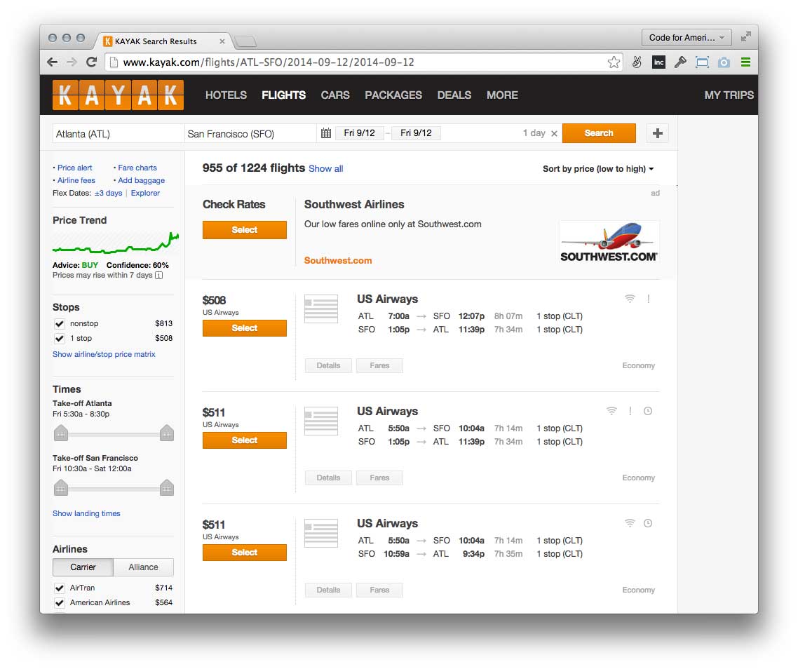
If the Department of Education provided developers with a window into the data they collected about colleges and universities—for example, the algorithm powering a college’s net price calculator, the average scholarship awarded to students, the average cost of attendance, the average class size, etc.—then developers could create interfaces to colleges and universities that employed robust filtering mechanisms. Interfaces similar to, say, Kayak.com would allow students to more effectively “window shop” based on the metrics they deemed valuable.
The Code for America working group also saw ways to improve the experience of completing the FAFSA. Our first thought was to provide a simpler interface for the application, similar to the wizard-like interface employed by Intuit's TurboTax software. Upon further reflection, though, we wondered if it was possible to avoid making students file the FAFSA altogether. Why not? The IRS already holds much of the information that the FAFSA requires, and families can already download their tax information as a PDF from the IRS website. Why couldn’t the FAFSA come to students pre-completed?
Eventually our working group sketched and documented the interactions that publicly available data might inspire and sent our report off to the DoE. And ever since then I've wondered, “What might civic engagement look like if government were able to provide increased access to everything it knew about its citizenry? What interfaces might we create?” In order to find out, government will inevitably need to deal with the technical, political and monetary debt that the DoE was able to conveniently ignore in their Request for Information.
Many companies are rising to the challenge, including Seamless Docs and Captricity. Seamless Docs helps governments migrate their forms online with an interface that is heavily inspired by Google Docs. Users simply upload a PDF form and Seamless Docs automatically detects its form fields. What's more, Seamless Docs provides a tool that translates PDF forms into responsive webpages, providing citizens the ability to access and submit government forms from any device. While the responsive translation is not 100% perfect, Seamless Docs does help governments seize the opportunities that digital media presents—no change agents required.
Captricity, on the other hand, is conceptually the reverse of Seamless Docs. While it also offers government employees the ability to upload a PDF form and tag its fields, Captricity's real strength lies in its ability to quickly and easily pull data from stacks of paper forms. As the company's CEO, Kuang Chen, explained to me over the phone: “Paper forms have affordances that are important for government: they're cheap, they're reproducible and they don’t run on batteries. We're working to bridge the gap between the accessibility of paper forms vs. the accessibility of the data those forms collect.” I personally have not had a chance to put Captricity through its paces, but Kuang claims that it is as easy as tagging a form and providing Captricity with a way to access completed copies of paper forms. Governments can provide that access, he explains, by either uploading scanned images, routing their mail to a PO box (where Captricity scans them) or having end users send in pictures of their completed forms.
Companies like Seamless Docs and Captricity are imminently applicable because they address a known problem: government needs to digitize its current workflow. But these companies only scratch the surface of the potential provided by today's communication technologies. In order to see conceive of new futures, we have to be brave enough to ask open-ended questions.
Through the looking glass
What might the future of forms look like if we didn’t have to worry about how to make it come about? Consider the following ideas:
-
What if forms came to us pre-filled?
Pre-filled forms are not an entirely novel concept; pre-filled tax returns have been proposed before. What if all forms (except ballots, of course!) came to us pre-filled? This would effectively change forms from a place where citizens provide information—information to which the government very likely already has access in the first place—to a place where they review information and manifest their intentions.
-
What if the government released an API alongside each of its forms?
If governments provided a way to access the individual components of forms (such as their instructions, their question/response pairs, their validation formulae / due dates, and their accepted payment methods), then developers could easily remix those forms however they saw fit. Essentially, this would open the market for third parties (i.e. companies like Intuit) to wrap beautiful interfaces around any forms, not just tax forms.
-
Why is it universally easier for citizens to give up personal data than to get that data back?
While some government departments are making strides in giving citizens access to their own data, those departments are presently the exception rather than the rule. Why? Public schools seem to indoctrinate us to this concept from day one: Data about student performance is handed over to teachers, departments, schools, districts, states, and the federal government, but individual students would likely find it difficulty to get access to that data. Why? If we are ever going to engage in the co-creation or co-conception of public value, citizens need just as much access to their data as the state.
-
How do we facilitate a more conversational approach to government?
Forms are an intermediary. In a perfect world, we would have conversations with our government
Applications like prompt.ly, an SMS platform for government, are a great start, because they allow government agencies to meet citizens where they're at. Similarly, efforts like the EFF’s Congress Forms API make it easier for citizens to contact their representatives. But how can we facilitate listening rather than merely creating new mouthpieces with which to talk at one another?
Designing information ecosystems is not a matter of collecting data or running it through some bureaucratic process. Rather, it is a matter of considering the ways in which each component of the system—protocols, processes and the platform itself—aids in the sense-making process. It is only through transparency and collaboration that we can work together to evaluate our current conceptions of public value and propose new ones altogether.
All together, now
The old ways we were taught to interact with government—by voting, writing letters, calling our representatives—aren’t enough anymore. It’s time to break the mold altogether, to embrace a new, technologically aided peer-to-peer way of solving our problems.
Gavin Newsom, Citizenville
I have a confession to make—one that I hope hasn’t been too apparent up until now. When I began drafting what would eventually become this article, I didn’t quite know where I wanted to end up. I knew that I wanted to write about forms because, as far as I could tell, nearly every Code for America project utilized them. More selfishly, I wanted to write about forms because “form design” gave me a pragmatic lens through which to continue my study of digital literacy. In the end, however, I have written this article in an attempt to look past forms to the ways in which user-centered design aids in the practices of government and citizen sensemaking. By breaking form design down into “protocol, process, and platform” design14, I hope to have shown something about how these elements relate to one another that might inform future design endeavors.
In his doctoral thesis “Making Visible,” designer Timo Arnall argues that designers cannot competently work with a medium until they thoroughly understand that medium's physical properties. Industrial designers, for example, will test a material's bendiness, its strength, its resistance to heat, scratching, etc. As far as I can tell, there are no equivalent tests for civic technology. In going about our work, civic technologists must borrow from user-centered design in order to determine the degree to which our work has utility and cultural resonance (i.e. “popularity”). If design is a rendering of intent, then user-centered design is a way of determining whether or not those intentions are coherently rendered.
Are forms really, then, the best way to help people manifest their understanding or share their perspective, one directional as they are?
Numerous people, from both the academie and the public sector, have acknowledged the curious ways in which millennials approach civic participation. A paper authored by Neta Kligler-Vilenchik and Sangita Shresthova describes this more formally as “participatory culture civics.” From their paper: [These are] organizations rooted within 'participatory cultures:' cultures which share a strong sense of community, have relatively low barriers to participation, informal mentorship structures and support for creating and sharing one’s creations (Jenkins et. al., 2006).
Participatory civic cultures are exemplified by organizations like Code for America as well as designers like Molly, Jake and Dave. Taken together, these actors are indicative of a larger movement in which citizens celebrate the cultural change capacities of digital, media and design literacy.
This is something that the future of government forms hangs upon. In a white paper released earlier this year, Dana Chisnell tells a story in which Washington State Ballot Designers invited representatives from companies that manufactured voting machines to observe usability tests of existing ballot designs:
After some negotiating, representatives from vendors accompanied a staff designer on a tour of counties to conduct usability test sessions on existing ballot designs. From this evidence, the vendors implemented support for better ballots. The importance of design literacy in the elections division in Washington is not to be missed: the project took persistence, planning, and commitment from both sides.
Dana Chisnell
In this case, Washington ballot designers leveraged not only their design literacy but also their position as potential customers to become de facto change agents in relation to their vendors—the opposite of the normal relationship between government and its vendors.
The way to ultimately improve the design of government forms, then, is to both invite participation and take part in design-mediated conversations. Examples of this abound. Dana Chisnell’s recently launched Center for Civic Design applies design thinking not only to ballots themselves but to all aspects of the voting experience—essentially improving the entire ecosystem in which ballot design is embedded. Moreover, Chisnell is not content with keeping her knowledge to herself. Chisnell’s “field guides” encourage participation by distilling the salient, actionable elements from her research and fieldwork.
Sharing the best practices of form design and promulgating design literacy should not be the remit of any one entity—in fact, it can’t be. The only way for citizens to participate in the design conversations necessary to responsibly govern a 21st century democracy is to acknowledge that these conversations are happening; join in; and share their findings. Through the creation of participatory civic cultures centered around design literacy, civic hackers and government employees alike can work to improve the citizen experience of forms once and, quite literally, for all.
Resources
Ready to break some new ground on your own forms? Fellow Code for America Fellow, Kavi Harshawat, and I led a panel on form design at this year’s Summit event and the group came up with the following resources15:
Books
A Web for Everyone
By Sarah Horton & Whitney QuesenberyForms that Work: Designing Web Forms for Usability
By Caroline Jarrett & Gerry GaffneyButterick’s practical typography
By Matthew ButterickThe Non-Designer’s Design Book
By Robin WilliamsArticles & Whitepapers
Let’s respectfully redesign government
By Molly McLeodHelping voters who have extraordinary abilities
By The Center for Civic DesignRedesigning election forms for overseas citizens (FPCA and FWAB)
By Drew Davies (Oxide Design)IDEO Takes on the Government
By IDEORedesign the ballot, create a political graphic language
By Melanie KahlBetter Design, Better Elections
By The Brennan Center for JusticeOther resources
Designing Print Forms
By Government Digital ServicesDigital Form Design Manual
By Government Digital ServicesDesigning usable ballots
By The Center for Civic Design and Oxide DesignPlain Language
By Whitney QuesenberyFalling In Love With Forms
by Aaron GustafsonExperience Mapping Toolkit
by Adaptive PathDesigning Usable Forms: The Three-layer Model of the form
by Caroline JarrettMicrosoft Word form templates
By MicrosoftDesigning Usable Forms: Success Guaranteed (PDF)
by Robert BarnettFootnotes
-
As suggested by Catherine Bracy, Director of Community Organizing at Code for America, in her TED Talk
Return -
ReturnGovernment 2.0 is not a new kind of government; it is government stripped down to its core, rediscovered and reimagined as if for the first time.
Tim O’Reilly -
ReturnHacker actions … are usually either in legally dubious waters or at the cusp of new legal meaning. Hence, they make visible emerging or contentious dilemmas.
Coleman, 2012 -
I believe this passage from the Sunlight Foundation does my conception justice:
ReturnNow, the question “where is all of our information” can be a tricky one to answer, but agencies can rely on threshold definitions. For example, any database with a maintenance cost over a certain number should be listed. Any information specifically described in a statute governing the agency should be described. Any form, report, or data described in the regulations governing the agency should be described. Whether the information is usually (or never) accessible via FOI request should be noted, and whether bulk data is available through a central portal should be spelled out as well.
-
An information ecosystem will never be purely digital. In their most elegant conception, information ecosystems utilize digital protocols with analog fallbacks. They're driven by open, digital processes in all matters requiring conditional logic and employ people only where matters of wisdom and/or judgement are concerned. They store data on an open, redundant, digital platform.
Return -
While I don’t have the space to re-print the report here, I highly encourage readers to review it—specifically pages 22-39. Not only it is great to see how this form evolves over two years, it’s also great to see how Davies and his team educate the FVAP about each change they’ve proposed.
Return -
Specifically the work of visual psychologist James J. Gibson
Return -
Designer Don Norman first introduced this concept in his book The Design of Everyday Things.
Return -
Problems such as the fact that radio buttons have no paper equivalent affects the instructional design of forms as well. Interaction designers are often taught to emphasize “recognition over recall,” to prioritize a user’s pattern-matching capabilities before their ability to recall information such as printed instructions. Thus, radio buttons can serve as a “better” way to solicit user input than a disconnected arrow because users ostensibly don't need to be taught how to use them (digital media has a bit of an unfair advantage in this regard because, unlike paper, it is inherently interactive). Finally, whereas paper forms are forced to present instructions as static blocks of text, digital forms can use both animation and “progressive disclosure” to provide engaging instruction at a user’s request.
Return -
The work of Dana Chisnell, Drew Davies, Caroline Jarrett, Matteo Penzo, Whitney Quesenbery, Ginny Redish, Jared Spool, and Luke Wroblewski is exemplary.
Return -
IDEO, for example, designed a set of personas for the Social Security Administration that included “Passengers,” “Explorers,” “Pathfinders,” and “Bypasses.”
Return -
Chisnell introduces these in her recommendations to the FVAP. I inquired as to her source and was told in an email: “The research is mostly in the realm of technical communication, but there is a lot related in the world of forms design. Some of the items in the list below also come from the Field Guides To Ensuring Voter Intent.”
Return -
Open processes lie at the crossroads of the principles guiding both Open Government and Open Source Software.
Return -
I’m certainly not the first person to think about interaction design as a compromise between three coppering models. Caroline Jarrett proposes a framework that breaks form design into perceptual design (layout), conversational design (questions and answers) and relationship design. More generally, Don Norman suggests that design represents a marriage between the System Model, a user’s Mental Model, and the Representation Model (or GUI).
Return -
This list builds upon a Google Doc created earlier this year by Jake Solomon and Molly McLeod. Other contributors included Ben Sheldon, Rebecca Ackerman, Ainsley Wagoner David Leonard, Dave Guarino, Marc Hebert, Alan Joseph Williams, Victor Zapanta, Deepa Kunapuli, Mollie Ruskin, James Hupp, The Public Policy Lab in New York, Sarah Fathallah, Cyd Harrell, and Dana Chisnell
Return
 Andrew Maier is a lifelong student of the design community who believes that creation and learning are synonymous. His current interests include security, law, cities, and autonomy. andrew@civicquarterly.org / @andrewmaier
Like this kinda stuff?
Consider donating to help us to continue doing this work! We also encourage reader comments via letters to the editor.